![econlifelogotrademarkedwebsitelogo[1]](/wp-content/uploads/2024/05/econlifelogotrademarkedwebsitelogo1.png#100878)

June 17, 2025

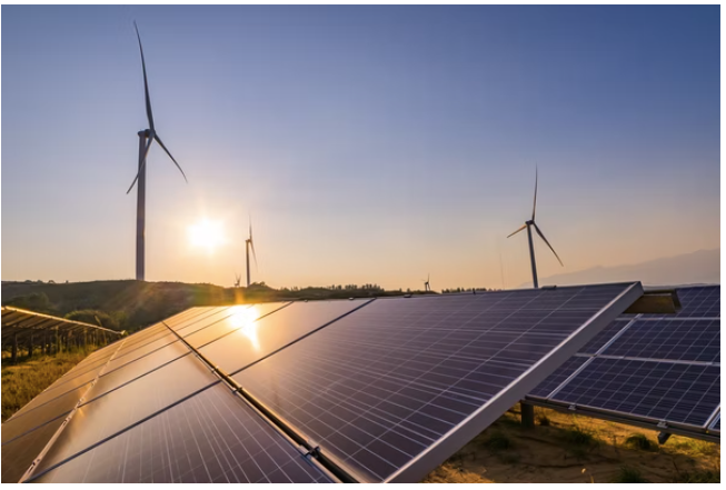
Comparing U.S. energy production and consumption to the rest of the world, we discover one major difference.
Comparing U.S. energy production and consumption to the rest of the world, we discover one major difference.
Called exceedingly thirsty, AI energy consumption will impact U.S. power generation and emissions during the next five years.
Tough to imagine and yet crucial for thinking of the future, the Lawrence Livermore Laboratory shares a handy energy use total infographic.
To see where energy comes from and where it goes, we can look at a chart with U.S. energy flows or the alternative energy that is described by xkcd.
In one handy graphic from the Lawrence Livermore Laboratory, you can see U.S. energy consumption and production for our homes, businesses, and vehicles.