![econlifelogotrademarkedwebsitelogo[1]](/wp-content/uploads/2024/05/econlifelogotrademarkedwebsitelogo1.png#100878)

October 12, 2020

The Lawrence Livermore National Laboratory's annual flow chart is the easy way to see all you want to know about U.S. energy use.
The Lawrence Livermore National Laboratory's annual flow chart is the easy way to see all you want to know about U.S. energy use.
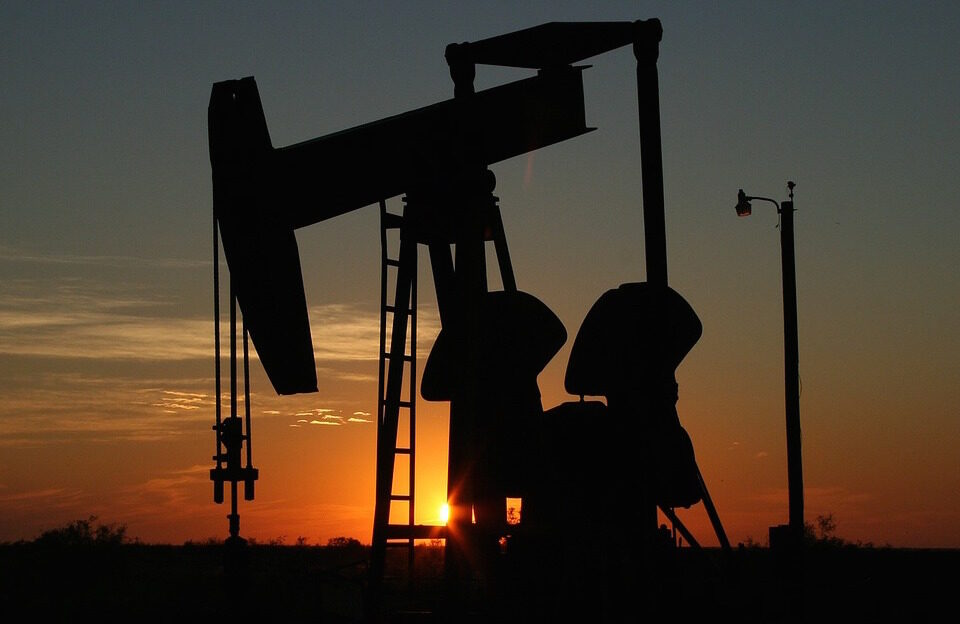
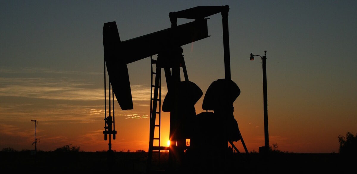
Hubbert’s Peak is the highest point on an oil well’s bell curve. Because the downside comes next, it represents the beginning of the end of our […]