Why Potty Parity Is About Much More Than the Bathroom
October 11, 2020
Why We Could Have Twist Tie Tariffs
October 13, 2020Today, an energy information update.
Energy Use
Annually, we get a new flowchart from the Lawrence Livermore National Laboratory. Showing where our energy comes from and where it goes, the chart is a handy snapshot of how we power our homes, businesses, and vehicles. (I added the larger labels.):

You can see that we used 100 quadrillion (or so) BTUs of energy in 2019. For one example of an energy pathway, please go to the natural gas rectangle, Moving upward and to the right on the blue line, 11.7 quads of natural gas go to generating electricity. Then, after the rust colored electricity line arrives in the residential box, we use 100 BTUs of that energy to make a piece of toast.
On the lefthand side, we can group our energy resources as renewable, nuclear, and fossil. Then, on the right, service and waste refer primarily to efficiency. Your car’s gasoline drives the wheels as an “energy service” and comes out of your car’s exhaust as “rejected energy.”
In this eight minute video, they do a good job of describing the flowchart:
Some History
Supply Side Changes
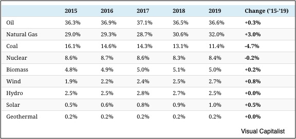
Looking at energy use changes by source, we see that natural gas stands out. Growing from 29 percent to 32 percent of our energy mix from 2015 to 2019, it has been nudging coal downward. At the same time, we boosted our demand for wind and solar with solar energy hitting 1 quad for the first time:
Demand Side Changes
As you can see, our homes and our businesses are using more energy but not our vehicles:
Our Bottom Line: Peak Oil
Traditionally, peak oil has referred to its supply. The term began with M. King Hubbert, a geologist who said in 1956 that our oil supply would peak within 15 years. It would touch the top of its bell curve and then slide from there as the world’s oil wells became exhausted.
But then fracking came along, supply skyrocketed, price plummeted, and we had a new outlook. It was still called peak oil but defined very differently. Now, peak refers to the demand for oil rather than its supply.
In a post-pandemic world, the Organization of Petroleum Exporting Countries expects that OECD (Organization for Economic Cooperation and Development) nations–the world’s wealthier countries– will decrease their demand for oil. As a result, they touched their peak and now are heading downward. Meanwhile, as developing nations become more affluent, their thirst for oil will continue to rise. Further adding to the drop in oil demand, OPEC projects that by 2045, non-fossil fuels will provide 27.5 percent of the world’s energy consumption.
This graph gives us a clue about the probable future of oil demand. OPEC projects a divide where developed economies use less and the emerging markets increase their demand:
Still though, OPEC thinks that world oil demand won’t peak for several decades. Others say it has already reached its high. We can look back at the Livermore data to decide for ourselves.
My sources and more: The Lawrence Livermore Lab and its press release were a logical starting point while we concluded with WSJ’s peak oil information. Then, if you read just one piece on peak oil, do look at what a Duke professor emeritus so logically predicted in 2013. It demonstrates that we should ignore all projections.
Please note that several of today’s sentences were in our previous econlife posts and our featured image is from the Livermore National Laboratory.
![econlifelogotrademarkedwebsitelogo[1]](/wp-content/uploads/2024/05/econlifelogotrademarkedwebsitelogo1.png#100878)


