Do We Care About Calorie Labels?
November 13, 2018
Why Our Shopping Score Matters
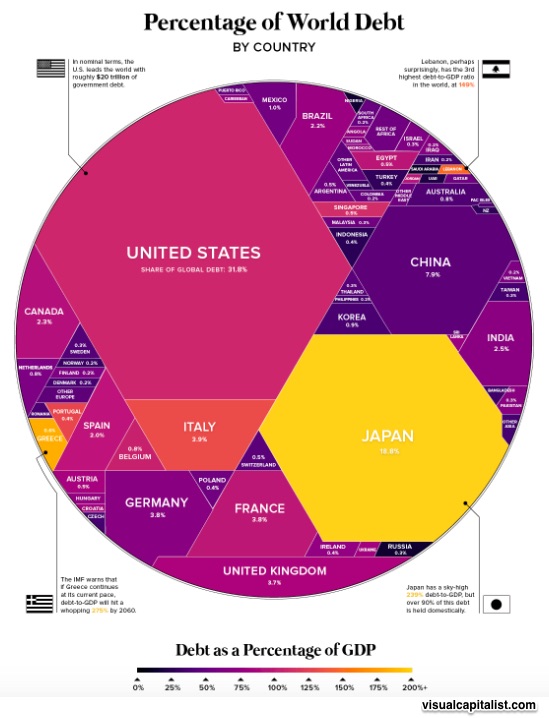
November 15, 2018If you want just one image of world debt, this is it:
But let’s look at some of the details…
Six Facts:
1. The world’s national governments have borrowed an estimated $63 trillion.
Governments usually borrow money by selling bonds to other governments, businesses (including banks), and individuals. Those bonds pay interest to their purchasers. How much interest? It depends on risk. The less likely a payback, the higher the interest rate.
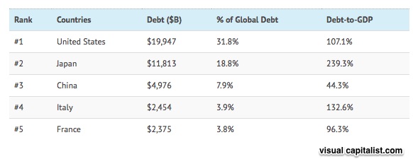
2. Using size as a measure of debt, the U.S is #1.
The U.S. owes 31.8% of the $63 trillion that the world’s national governments have borrowed. Guilty of debt creep, what the U.S. owes has crept up from $6.9 trillion (54% of GDP) in 2001 to $20 trillion in 2017. Yes, we are talking nominal rather than real dollars but still the increase is considerable.
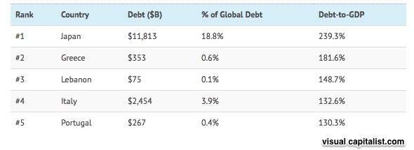
3. Using a debt to GDP ratio to measure world debt, Japan is #1.
But for Japan, it’s not as worrisome as it sounds. At more than 90%, most of Japan’s debt is owned domestically.
4. The top five holders of the world debt owe 66% of the total
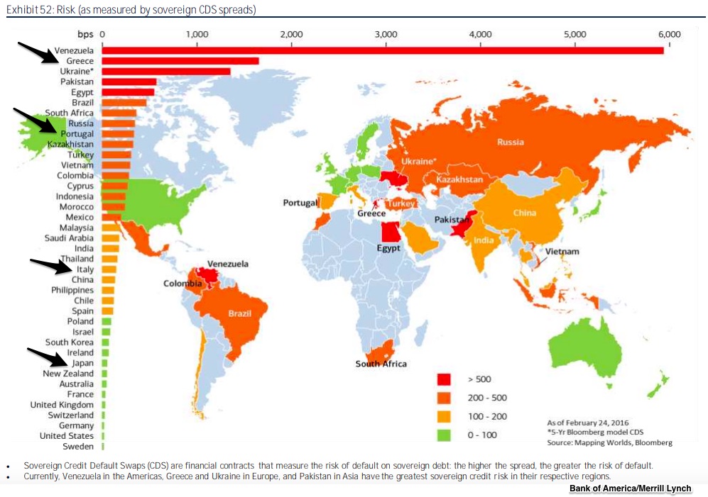
5. The world’s riskiest debt is from Venezuela.
Although this risky debt list used February 2016 data, it still is pretty accurate. You can see that Greece and Portugal had pretty high debt to GDP ratios. So it makes sense that they are in the orange top risk zone. Meanwhile, Japan, in green, is pretty low.
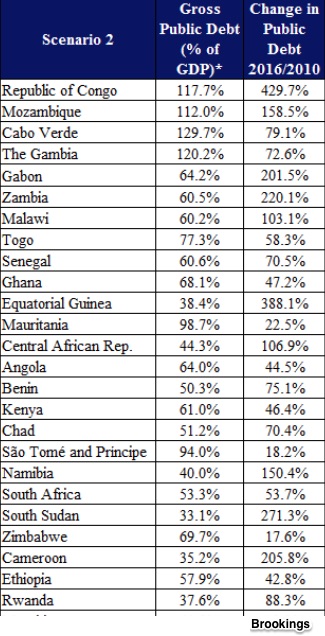
6. Africa’s national debt has also been growing.
This is some country data:
Our Bottom Line: Sovereign Debt
We’ve said that debt to GDP ratios are one way to judge whether a debt is healthy. That however is only the beginning. Next we need to ask if the country is developed or developing. Predictably, a developed nation can accommodate a higher ratio. Rather astoundingly though, at 239%, Japan’s debt to GDP ratio is gargantuan and yet our concern for Puerto Rico, closer to 65.9% (2015) is far greater. Then, we can also check to see if the country has a history of defaulting (like Greece) and whether its political institutions are strong enough to endure austerity.
My sources and more: The World Economic Forum and Visual Capitalist were ideal for the visuals and some analysis. Then for much more insightful analysis, I recommend Brookings for understanding African debt and Puerto Rico. But for a vast array of the most amazing infographics and maps, this Bank of America/Merrill Lynch Report is especially worth your time.
Several sentences in today’s “Bottom Line” were in a previous econlife post.
![econlifelogotrademarkedwebsitelogo[1]](/wp-content/uploads/2024/05/econlifelogotrademarkedwebsitelogo1.png#100878)


