Our Weekly Economic News Roundup: From Solar Clocks to Mars Trips
March 16, 2024
Why We Should Worry About Our Demand For Sand
March 18, 2024New housing markets are shrinking. But it’s the homes that are getting smaller:
Through a series of maps and graphs, we can understand why new homes are the smallest since 2010, Most crucially, smaller homes meant cheaper homes. While square footage was down by 4 percent, prices fell 6 percent.
Housing Markets
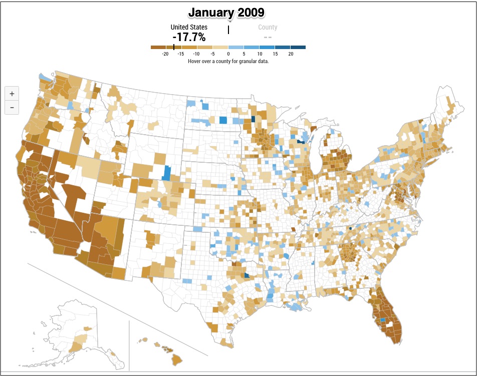
We can start with several NY Federal Reserve housing price maps that let us compare year-over year changes in home prices. My “brownish” maps illustrate the last housing price plunge. Soon though, the maps get increasingly blue.
Housing prices plunged before and during the Great Recession (December 2007-June 2009):

However, by January 2012, average prices were barely dipping:

By the time we get to 2017, the trend flipped with a bluish map having prevailed for several years:

Looking at April 2022, we see that prices were up a whopping 19.3 percent:

Since then, at a reduced rate, they’ve kept on ascending:

Our Bottom Line: Supply and Demand
Explained by the NY Times with economic, demographic, and regulatory reasons, the small house response is predictable.
It’s classic supply and demand.
Initially, on the demand side, even with rising prices, there were more millennial buyers. During those years, we had low mortgage rates and a pandemic induced search for more space. Meanwhile though, we had a decreased supply of existing homes. As a result, with supply decreasing and demand increasing, we had rising median home prices:

But predictably, after mortgage rates rose, prices moved into territory that potential buyers could not enter. Recognizing the threat, home builders responded with smaller homes that brought their own costs for land, labor, and capital down. Because the increase in supply brought equilibrium price down, we wound up with an increase in quantity demanded:

Shifting from graphs to life, we saw median home size and price shrink.
My sources and more: Happily, two articles, here and here, converged to inspire today’s post. But then, at econlife, our past post added to the picture. And finally, as did I, you might enjoy the complete animated sequence of NY Fed housing price maps.
Much smaller than the median new home, our featured image from the NY Times is an increasingly popular 400 to 600 square foot house.
![econlifelogotrademarkedwebsitelogo[1]](/wp-content/uploads/2024/05/econlifelogotrademarkedwebsitelogo1.png#100878)


