![econlifelogotrademarkedwebsitelogo[1]](/wp-content/uploads/2024/05/econlifelogotrademarkedwebsitelogo1.png#100878)


Where State Money Can Come From
June 7, 2021
How Shrinkflation Makes More Become Less
June 9, 2021
Two years ago, we looked at six handy facts about taxes. Now we have four more.
But, before getting to our four facts, we should note that a vast number of people believe that taxes are unfair. In this Pew Survey of 9,895 randomly chosen U.S. adults, 62 percent expressed a negative opinion of the system:

Our four facts can help us decide what is fair.
Four Handy Tax Facts
1. Below, we can see the proportion of total income taxes that each income group paid between 2001 and 2019. The trend is upward for the higher earners:

2. Comparing 2017 to 2018, we can see the impact of President Trump’s tax legislation. Economist Ed Yardeni concludes that the top 5 percent–the upper middle class–benefited the most:

3. The U.S. tax to GDP ratio has been relatively constant. With a high point of 28.3 percent in 2000, for 2019, it was 24.5 percent:

4. The U.S. tax to GDP ratio is relatively low when we compare it to other OECD nations. Out of 37 nations, the U.S. is #32:

Our Bottom Line: The Best Tax Act
The Tax Reform Act of 1986 achieved comprehensive tax reform. It compressed multiple tax brackets into two (15%, 28%) with a third that has been called the phantom bracket (33%). It also eliminated most tax deductions and entirely erased loopholes and shelters. Its content and process serve as an ideal benchmark.
Content
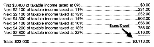
Before the Tax Reform Act of 1986 was passed, the person who earned $23,000 of taxable income paid 7 different rates. For a top earner, the list was much longer
Process
It took TWO YEARS for lawmakers to wheel and deal, talk and balk until they finally had a compromise. At the time, we had a Republican Senate, a Democratic House and the Republican President. Some complained about tax dodgers. Others were angry about high rates. People were concerned that the poor paid too much and the system was convoluted.
And yet, enough people figured out how to work together. We had President Reagan’s public charm and private maneuvering. At the same time, the Democratic chair of the House Ways and Means Committee scheduled a summer of public hearings during which more than 450 people testified. In addition, there was a series of secret meetings. You get the idea. Socially and professionally, over beer and in committee, they agreed to their tradeoffs.
When President Ronald Reagan said that the Tax Reform Act of 1986 was “clear, simple and fair for all,” he almost said it all. It returns us to the Pew survey and what we now need.
My sources and more: Looking for today’s topic, I first checked Dr. Ed’s Blog. From there, for the world view, I suggest the OECD. And finally, Pew is always excellent for the country’s political pulse. Then, for still more that we have not covered, the Tax Foundation has the facts from the right while Brookings Tax Policy Center tilts in the other direction.
Please note that pats of today’s “best tax” section were in a previous econlife post.


2 Comments
Dr. Schwartz – I’m a little confused by the data in this post. In looking at Dr Ed’s Blog, the data table that he sites is different than the one presented here. Both your conclusion and his conclusion line up, but that table here shows tax rates increasing – Can you clarify this for me? I was hoping to share this with students.
Thank you for your time.
I am not sure if I am answering your question so please let me know. Also this link might be helpful:
https://taxfoundation.org/publications/latest-federal-income-tax-data/#:~:text=The%20top%2050%20percent%20of,percent%20combined%20(29.2%20percent).
This is how I interpreted the numbers:
The first sequence of graphs refers to the percent of total tax revenue paid by each group. The second list is about income tax rates for individuals in each group. The first group displays the increasing share of tax revenue that the highest earning income group pays. Meanwhile the second list of numbers shows that the highest earners got an income tax cut but the upper middle class got an even better deal. Do you see it differently?