![econlifelogotrademarkedwebsitelogo[1]](/wp-content/uploads/2024/05/econlifelogotrademarkedwebsitelogo1.png#100878)


Our Weekly Economic News Roundup: From More Yogurt to Fewer Avocados
April 13, 2019
Six Handy Facts to Know on Tax Day
April 15, 2019
A mathematician once told us that the length of the British coast is infinite. Yes, when you see it from a distance, it appears to be an unbroken measurable line. However, the closer you look, the more you see. There are small inlets that have tinier indents. They go on forever, getting smaller and smaller.
Our pay data reveal the same phenomenon. Whether zooming in on the country or a company, the closer we look, the more we see.
But first, do enjoy this brief zoom that starts large and winds up with a dendrite area:
Wages and Salaries
U.S. Median
Characterizing a labor force of approximately 162,000,000 people, the Bureau of Labor Statistics (BLS) tells us that median (the middle) weekly earnings are $900. Multiplied by 52, we get approximately $50,000.
Corporate Median
However, zooming in from the country to individual businesses gives us a very different picture. Last year, for the first time, publicly traded companies were required to report annually the pay of their “median worker.”
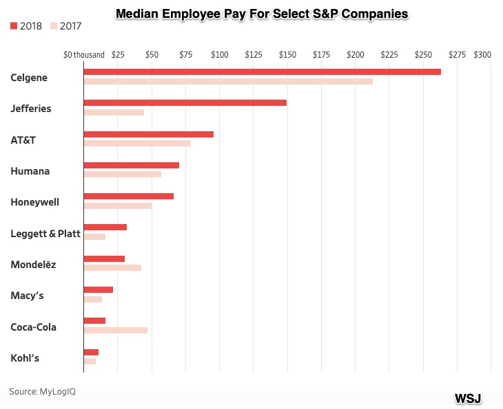
Some numbers were not close to that $50,000 median. At health insurer Humana, the median worker’s pay increased from $57,386 in 2017 to $70,000 last year. They say the reason was an hourly minimum wage boost to $15. Even more astounding, at the financial firm Jefferies, the median jumped from $44,584 to $150,000. The reason there was the divestiture of most of a lower paying subsidiary.
Meanwhile, at Coca-Cola, the trend was the opposite. Because it was based on the pay of workers in South Africa, the median number went down from $47,312 to $16,440. However, Coke said that without South Africa, the number was somewhat more, at $35,878.
WSJ had this summary for 10 companies. With the brighter orange representing 2018, the graph shows median pay up at AT&T and down at Mondelez (maker of snack foods that include Oreo and Ritz):
Our Bottom Line: Circular Flow Model
Rather like looking at the British coastline, the circular flow model that follows illustrates a big picture that can come in handy. As a model of the U.S. economy, it shows the position of wages and salaries.
In the lower loop of the model, households sell their land, labor, and capital to businesses. In return, businesses send income as rent, wages and salaries, interest and profits:
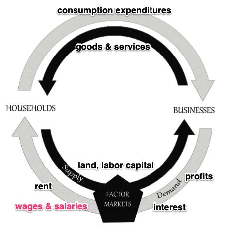
If, like the fractal video, you zoomed in on the circular flow, you could use this WSJ interactive and from there, yourself.
So where are we? For the country and for every company, a closer look can reveal an infinite number of moving parts.
My sources and more: If you just read one extra article, do look at this Yale Daily News Benoit Mandelbrot obituary on fractal math. To continue after that, for the big stats, you might want to go to BLS and then to WSJ for the company pay summary. Finally, if you want more on company pay, WSJ had the links.

