![econlifelogotrademarkedwebsitelogo[1]](/wp-content/uploads/2024/05/econlifelogotrademarkedwebsitelogo1.png#100878)


Why Aren’t We Worried About the Budget Deficit?
October 31, 2018
What Do Coca-Cola and Reese’s Peanut Butter Cups Have in Common?
November 2, 2018
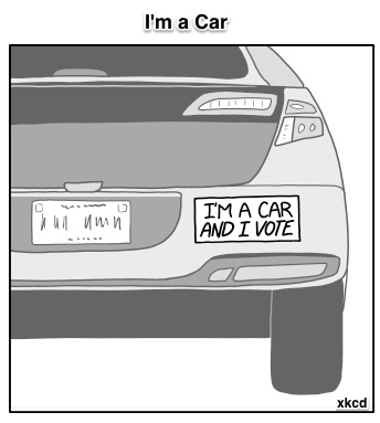
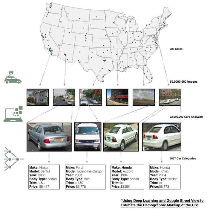
Google Street View has 50 million images from 200 U.S. cities that researchers at Stanford University have been analyzing. Their goal? Use our vehicles to learn more about us.
This is the story…
What They Know
Researchers at Stanford realized they could access an information bonanza just by connecting an estimated 22 million vehicles with location data. From there, they could form conclusions about what we buy, what we earn, and how we vote. They even could project how much we would pollute.
First, they needed to teach the computers car recognition. Hundreds of people helped. Some knew, for example, the difference between the headlights on a 2007 and a 2008 Honda. Others could distinguish a 2001 Ford F-150 Supercrew LL grille from a 2011 Ford F-150 Supercrew SVT grille. All was fed into the computers. Classifying the cars in Google View took just two weeks–a project that would have taken you and me, at 10 seconds per image, more than 15 years.
Knowing makes, models, years, and zip codes for approximately 22 million cars became a springboard for some predictable and not so predictable conclusions:
- Based on miles per gallon and other car attributes, Casper, Wyoming has the largest per capita carbon footprint.
- Distinguishing between expensive and cheap cars, the data revealed that Chicago has the most income segregation among neighborhoods.
- Cities with more sedans than pickup trucks observed during a 15 minute drive have an 88% chance of voting Democratic during the next Presidential election.
- Extended-cab pickup trucks are associated with populations that tend to vote Republican.
- Vehicle clusters can indicate whether a population is primarily Asian (Hondas, Toyotas, minivan), African American (Chrysler, Buick, sedan), or Caucasian (pickup trucks, Volkswagens, minivan).
Image Examples
 Our Bottom Line: Big Data
Annually, we spend more than $1 billion on the American Community Survey (ACS). Yes, it represents considerable data. The problem though is the lag. From collection to publication, the delay can be as much as half a decade. Another example is the Consumer Price Index (CPI) that also reflects a labor intensive survey-based approach.
Thinking of the ACS, the CPI, and other information initiatives from the U.S. government, I can only wonder when our government will adopt a more efficient complement. Whether looking at Google Street View or the Billion Prices Project, you can see the immense potential (and peril) from new data collection techniques. At their best, they can shape more accurate, up-to-date, and targeted fiscal and regulatory policies.
But I would also be concerned with a government that knows even more about us.
My sources and more: This NY Times description of the Google Street View/Stanford Car Project had the perfect overview. But for more on the potential for big data and inefficiency from government, do look at this paper (don’t skip the appendix) from the researchers at Stanford. Lastly, if you want further confirmation of big data’s potential, I suggest the Billion Prices Project.


