Where Education and Healthcare Could Be Better
October 17, 2018
How Legal Marijuana Could Make the Canadian GDP Too High
October 19, 2018#TBT: Our Throwback Thursday begins in 1960 with Chase Manhattan Bank and a new kind of logo. It ends now, with American Airlines, and the U.S. Copyright office.
The New Chase Logo
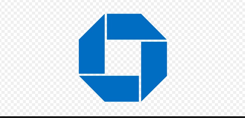
Several years after the Chase National Bank and the Bank of the Manhattan Company merged, the firm needed a new logo. Third in line from the top, David Rockefeller (the first John D.’s grandson) was in charge of the project. And that made the difference.
The bank’s CEO and president wanted a representational logo like their building or the sculpture out front. Rockefeller said no. He liked the abstract image crafted by a design firm they had hired. At the time though, abstractions were the anomaly. Few firms had them.
You can see (and feel) the immense difference between the old and the new logo:
Asked why the logo still works today, its designer explained that it was bold, recognizable, and “an empty vessel in which meaning could be poured.” Large or small, in color or black and white, it could be reproduced on stationery, used for TV, and printed in newspapers. And today, in media no one imagined in 1960, JPMorgan Chase uses versions of the very same logo:
The New American Airlines Logo
Like Chase, American Airlines replaced a more representative logo with an abstract image. As you can see (below), the new American Airlines logo suggests the head of a white eagle “poking through” a blue and red diagonal band. Although the new (trademarked) logo has been around since 2013, they also want the broader protection of a copyright. But three times–2016, 2017, and now–the U.S. Copyright Office has refused. Their reason? They say the logo has a common color palette, everyday shapes, and inadequate creativity. So American is suing the Copyright Office in federal court.
American used its old logo for close to 40 years:
Our Bottom Line: Intellectual Property
Starting with the Constitution, our nation has formally recognized our right to own the intangible property that we create. Our founders knew that in a market economy ownership and profit are partners that spur innovation and growth. However, because our intellectual property is tougher to define than a physical implement, we have a Copyright and Trademarks office to establish what is “ownable.”
Comparing the Chase logo and American’s, don’t you wonder why the Copyright Office rejected the American application?
My sources and more: Rarely do two separate but interesting topics converge. However, the current American trademark rejection perfectly complements the Chase logo story in this 99% Invisible podcast. From there, I did check the facts at the JPMorgan Chase website and found some interesting banking history.
![econlifelogotrademarkedwebsitelogo[1]](/wp-content/uploads/2024/05/econlifelogotrademarkedwebsitelogo1.png#100878)


