The Problem With Vegan Names
September 17, 2019
Where the Federal Deficit Can Fool Us
September 19, 2019Showing us that things are not always what they seem to be, the Belgian surrealist artist René Magritte said, “this is not a pipe.”
Similarly, when the BLS (U.S. Bureau of Labor Statistics) says average hourly earnings are up, it is not necessarily as it appears.
Measuring Average Hourly Earnings
In its August summary, the BLS tells us that average weekly earnings are up 3.2 percent from a year ago. However, for real average weekly earnings, the increase is .8 percent.
Okay, so we have 3.2 and ,8.
From there, a Brookings paper tells us some other possible ways to look at earnings.
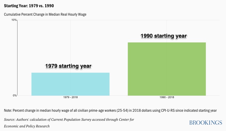
First of all, “when” matters because the change in wages depends on your time period. If you select 1979 to 2018, the uptick is just 3 percent and the headlines would say wage stagnation. However, a 1990 beginning changes the story. Between 1990 and 2018, the median hourly wage, adjusted for inflation, is up seven percent.
You can see that the cumulative change in the hourly wage can look very different:
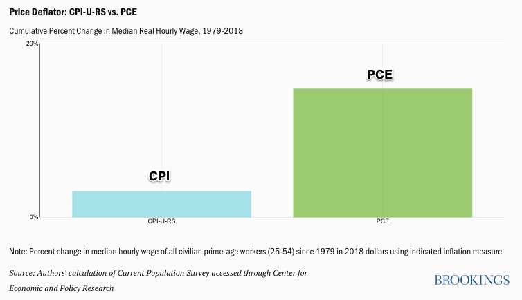
Next, it also depends on which inflation indicator you use. After all, we are looking at real wages. If I get a raise but it buys the same goods and services, it is not really more. The CPI-U-RS (Consumer Price Index for all Urban Consumers–Research Series) measures inflation differently from the PCE (Personal Consumption Expenditure Index).
With the former, from 1979 to 2018, we wind up with substantially less of a wage increase than with the latter. One says 3 percent and the other 15 percent: 
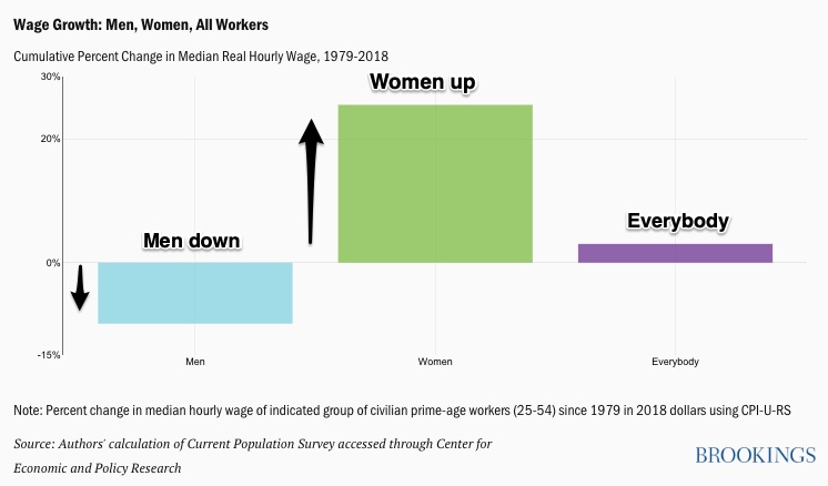
A third consideration is gender. For women, the increase is substantial but it’s rather gloomy for men, even when we use the CPI. (I’ve added the arrows and labels.):
And finally, we can even zoom in to one percentile to track the poorest workers or the richest or those in between. Each group has had a different experience. As everyone knows, the top one percent has fared well recently. But, since 1979, the 20th percentile has done better than the median (those at the middle of the distribution):
Our Bottom Line: Confirmation Bias
Sometimes we “cherry pick” statistics to confirm what we already believe. Called confirmation bias, we can validate what we think is true by selecting the relevant numbers.
So yes, wages have gone up by 3.2 percent. But not necessarily.
Returning to where we began, we can respond with the equivalent of, “This is not a pipe.”
My sources and more: This BLS press release tells us the average hourly wage increase. Then, the NY Times (and other media) just emphasize the 3.2 percent number. However, this Brookings Report has some additional possible permutations.
![econlifelogotrademarkedwebsitelogo[1]](/wp-content/uploads/2024/05/econlifelogotrademarkedwebsitelogo1.png#100878)


