When a Tariff Is Like a Butterfly
January 9, 2020
January 2020 Friday’s e-links: NHL All Star
January 10, 2020There is more to a color than what we see.
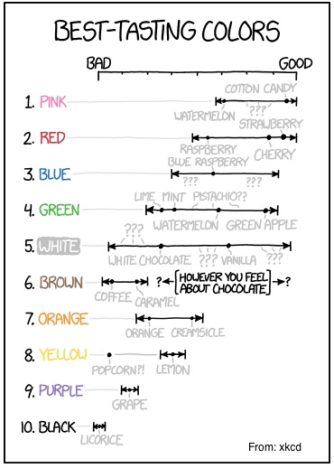
It can be about taste:
And about power.
Color Trends
The people at the Pantone Institute of Color tell us that they search the world to select a color of the year. They consider art, film, and entertainment. They look at clothing and lifestyle. They identify trends and preferences.
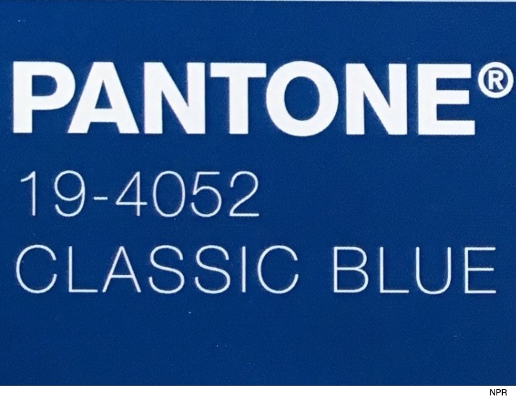
This year, Pantone selected Classic Blue. They predict that Classic Blue will adorn our eyes and our homes. It will shape our response to food and drink. And, as an “honest” and “classic” color, it will instill “calm, confidence, and connection”:
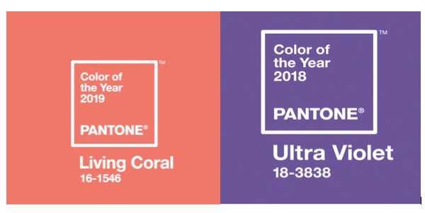
For 2019 and 2018, Pantone selected more lively colors. They said that Living Coral reminds us of the beauty of our marine life. By contrast, Ultra Violet’s “creativity” is “inspirational”:
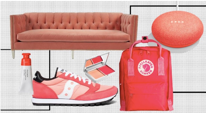
You can see how Pantone reflects the past and impacts the future through the color of the year. In 2019, these were some possibilities:
Color Psychology
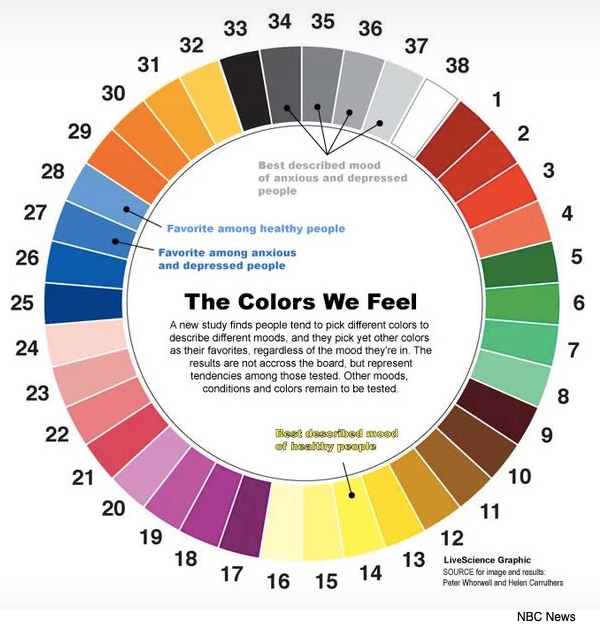
It is also possible that we associate a color with a mood. In a survey that took place approximately 10 years ago, 323 participants were sent the following color wheel. The response indicated that happier people seem to prefer yellow. As for blue, the shade makes a difference. Reported in the journal BMC Medical Research Methodology, these were the colors:
Even the colors we select for our cars could say something about our personality. A black car can reflect power while silver might suggest action and confidence. Meanwhile blue embodies stability and yellow, happiness. As for gray, we (yes I have had gray cars) prefer subtlety.
Our Bottom Line: Competitive Market Structures
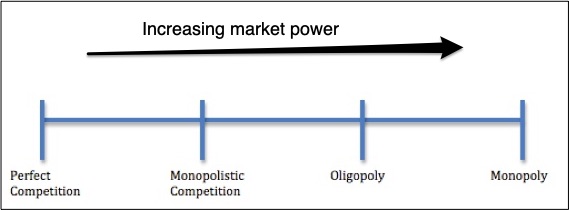
Today’s title asks why companies care about color. The answer takes us to competitive market structures. Looking through an economic lens, we can see a continuum with perfect competition at one end and monopoly at the other. Moving from left to right, firms get larger and have more pricing power. They also want to differentiate their products. One way is through the power of color.
The four basic market structures:
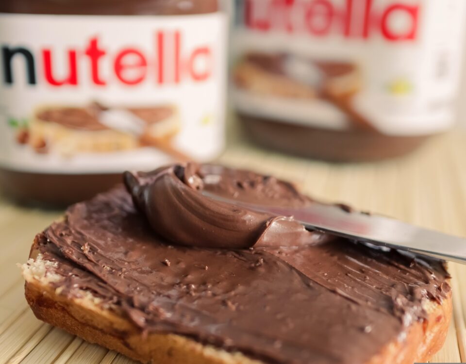
Companies that have used the power of color:
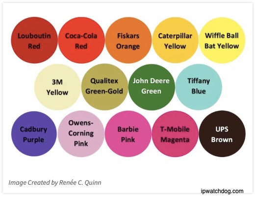 And finally, this year, do be on the lookout for Classic Blue #19-4052.
My sources and more: Yesterday, the The Indicator podcast on color made my daily walk more interesting. Then, I visited the Pantone website and this CNN article and discovered studies that related color to culture and emotions.
Please note that none of the “research” cited today appears to have had scientific rigor. But all do reflect the power of color.
![econlifelogotrademarkedwebsitelogo[1]](/wp-content/uploads/2024/05/econlifelogotrademarkedwebsitelogo1.png#100878)

