![econlifelogotrademarkedwebsitelogo[1]](/wp-content/uploads/2024/05/econlifelogotrademarkedwebsitelogo1.png#100878)


How Young Immigrants Add to an Older Population
March 18, 2026
Why We Should Worry About a Sulfur Squeeze
March 20, 2026
With natural gas in the headlines, let’s take a closer look:
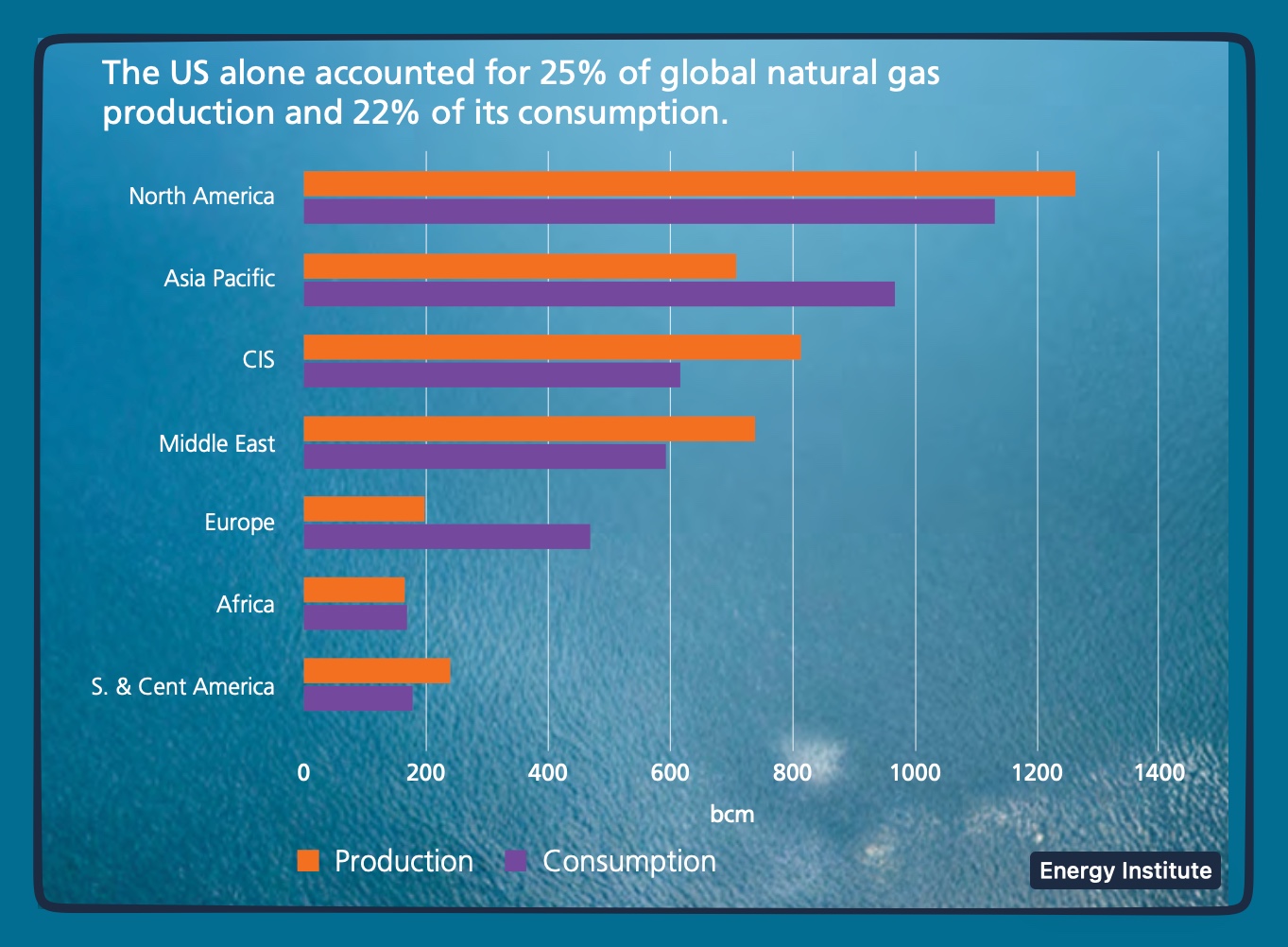
The world’s “powerhouse” natural gas producers are the United States, Australia, and Qatar, while the Qataris have the lowest cost fields.
Natural Gas
United States
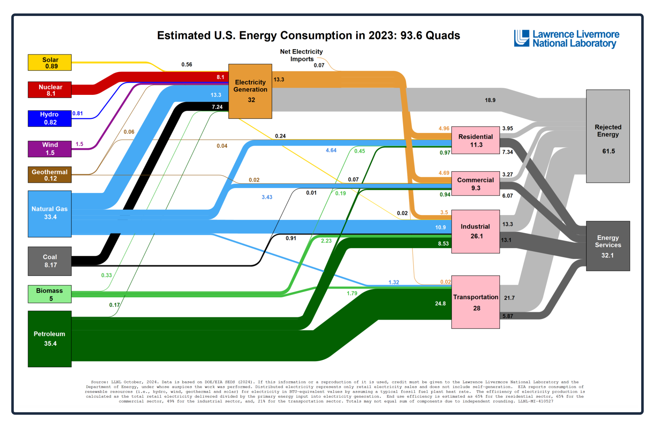
We use and waste a lot of energy. One quad–a quadrillion Btus–is the energy equivalent of approximately eight billion gallons of gasoline. According to Livermore’s most recent estimates from 2023, we consumed close to a whopping 93.6 quads. Showing where our energy comes from and where it goes, the Livermore chart is a handy snapshot of how we power our homes, businesses, and vehicles.
Below, natural gas is the light blue slice, providing close to one third of the totals. Starting at the natural gas rectangle, we can move upward and to the right on the blue line where 13.3 quads of natural gas go to generating electricity. Then, after the rust-colored electricity line arrives in the residential box, we use a tiny bit of those BTUs (100) to toast a bagel:
The World
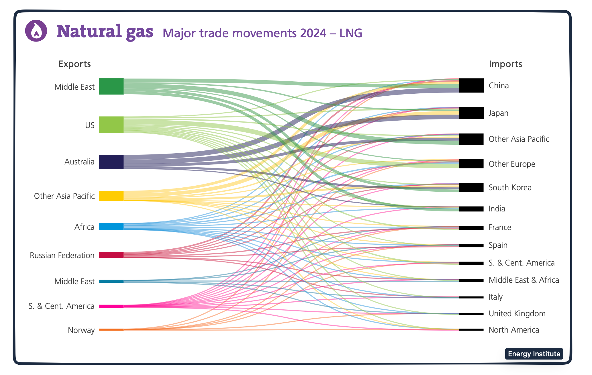
Combined at 60% of global totals, the U.S., Australia, and Qatar dominate production. Mostly in Qatari territory but also in Iran, the largest natural gas field in the world is called North Field or North Dome in Qatar and South Pars in Iran. With Asia a typical destination, the Qataris first liquefy the natural gas and then were exporting it to Asia through the Strait of Hormuz. Meanwhile, China, as one of the largest importers, receives approximately one third of its natural gas from Australia.
According to a Bloomberg Odd Lots podcast, “80 to 90 percent of the “cost is in the movement.” As a result, the price of natural gas depends on the distance that it moves.
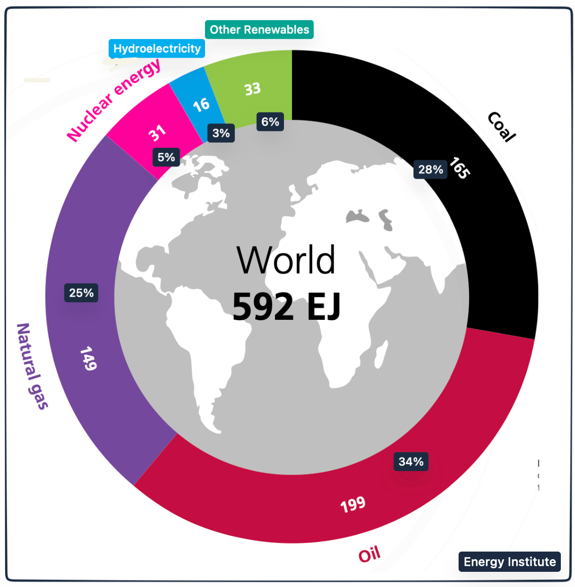
Our Bottom Line: World Energy Consumption
In the following graphic, the Energy Institute uses the EJ, the exajoule as their basic metric. It is equal to approximately 174 million barrels of oil.
Comparable to U.S. trends, natural gas represents close to 25% of global energy demand:
Where are we? I hope that today’s graphics demonstrate the potentially catastropic impact of natural gas closures.
My sources and more: An Odd Lots podcast inspired today’s post. Then, it was time to return to Livermore statistics and this past econlife post. However, the energy institute was my newest and most valuable discovery.
Please note that several of today’s sentences were in our previous econlife posts.

