![econlifelogotrademarkedwebsitelogo[1]](/wp-content/uploads/2024/05/econlifelogotrademarkedwebsitelogo1.png#100878)


How U.S. Inflation Compares to Other Countries
February 8, 2022
Why the SEC Will Look For Carbon Footprints
February 10, 2022
Happily, I discovered an OECD dashboard that conveyed all we need to consider for jobs markets. Then, sadly, I looked at the small print and saw 2015-2017 data. So, the OECD Dashboard is today’s place to start. But then we need the update:

Jobs Markets
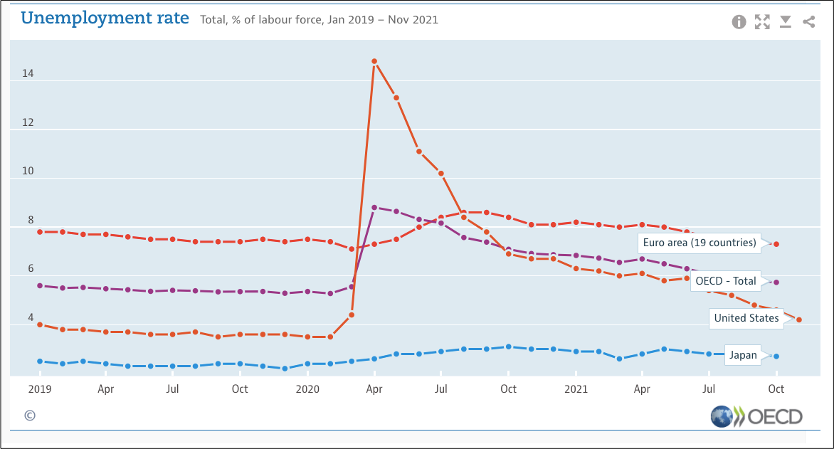
Looking at Quantity, Quality, and Inclusiveness, we see the U.S. fares best with quantity.
Quantity
Recovering after a Covid surge during April, 2020, the U.S. unemployment rate soon returned to all time lows:
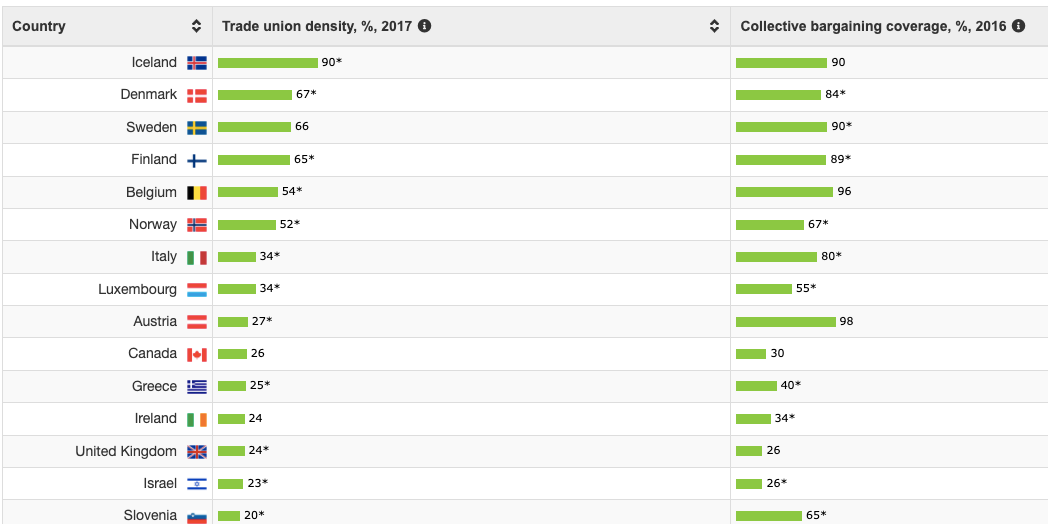
Quality
Not sure if my criteria was ideal, I copied the 15 countries with the most union density. The U.S. is near the bottom at 10 percent:
Inclusiveness
Meanwhile, for inclusiveness, I selected the gender pay gap. We have seen in past posts that the gap is much more complex than one number but, below, here it is. You can see that the U.S. gender wage gap is among the largest:

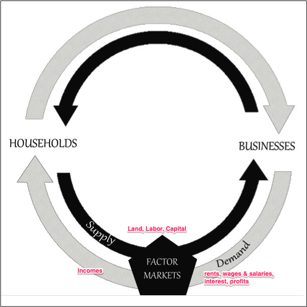
Our Bottom Line: Circular Flow Model
When we look at jobs in a Circular Flow Model of the U.S. economy, we are in the lower loop’s factor markets. In a factor market, the price (wages) and quantity (employment) of labor are determined through supply and demand. The supply side comes from more than 100 million households. Meanwhile, the businesses that demand labor pay us with income composed of wages and salaries:
Then, if you want to know where we’ve been and where we are going, this the Atlanta Fed Spider Chart will come in handy. With Spider Chart lines moving to an outer perimeter that represents maximum levels, the jobs situation has returned to many of our pre-Covid levels:

Finally, we should note that The Washington Post told us that the labor situation is not as good as it might look. For example, we have fewer people in the labor force than could be working:

Indeed, whether looking at spider charts, participation rates, or indeed all jobs markets data, we can always use a circular flow model to see where the facts fit into U.S. economic activity.
My sources and more: The OECD 2018 Dashboard was just a two page infographic. Somewhat similarly, the Atlanta Fed conveyed the labor markets situation as a spider graphic. Then, here, here, and here, the OECD published more recent job markets statistics.

