![econlifelogotrademarkedwebsitelogo[1]](/wp-content/uploads/2024/05/econlifelogotrademarkedwebsitelogo1.png#100878)


Our Weekly Economic News Roundup: From Pine Beetles to Golf Hats
April 17, 2021
How to Untangle Africa’s Supply Chain
April 19, 2021
When we try to figure out the impact of the pandemic on all of us, we need to look at some of us. While it is easy to know that mothers with children under age 13 have been affected, it is tougher to quantify the impact.
Through a recent paper, The Hamilton Project provides a framework for understanding the pandemic gender gap..
The Pandemic Gender Gap
1. While The Hamilton Project paper explains the childcare increase for mothers with young children, the orange bar on the graph says it all:

2. Pre-pandemic, labor force participation rates (LFPR) for married women without children and most women with children were converging. Even for married women with children under 13, their LFPR was accelerating:

3. Now though, the pandemic has exacerbated the LFPR gap between moms with children under 13 married and everyone else. There were 2.3 million fewer women in the labor force between February 2020 and 2021. One major reason was young children.
The numbers are shown in the following graphic. Do start with the inner circle to see the unemployed (defined as people in the labor force without a job but looking), those not in the labor force (not called unemployed), and those who are employed. In each category, mothers left their jobs:

4. Then, looking more closely at the data, we see that your race and ethnicity displayed where the impact was most severe. For Prime-Age Hispanic mothers with young children, the hit was hardest:

5. Lastly, to LFPRs, family facts, race, and ethnicity, we need add just one more number. We can look at how time use has changed, and how moms, much more than dads, are spending time with their children:

6. And finally, we should look at the pandemic gender gap beyond our borders. Yes, while the extent varies considerably, women’s plight is universal:

Our Bottom Line: Production Possibilities
We are underutilizing the skills of women who want to work outside the home. As economists, we can illustrate the shortfall through a bowed-out line and a dot. The line is a production possibilities curve showing the infinite ways that output can be maximized. By contrast, the dot shows one point in time. Positioned inside the curve, it show that the country is producing fewer goods and services than its potential.
As a result, the dot is now inside the line especially because women with younger children are responding to the impact of Covid:
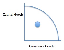 Returning to today’s beginning, we said that some of us affect all of us. And indeed, underutilizing certain women’s abilities and time requires a dot that impacts all os us. The dot reflects the pandemic gender gap.
My sources and more: For insight, the Hamilton Project is always a handy source. Looking at their recent papers, I was curious about how the pandemic gender gap. Then, for the global view, the UN report was ideal.


