The Athletic Programs That Score High for Gender Bias
April 2, 2017
Why the U.S. Government Cares About a Snuggie
April 4, 2017Sometimes the real size of a big number is tough to grasp. When people create a zero to one billion scale, close to half of them misplace the million mark. (Hint: 500 million is halfway.)
As a result, it is easy to misunderstand the President’s preliminary budget proposal.
The Trump Budget Blueprint
The Entire Budget
We could say that proposed spending in the federal budget is $4.2 trillion. But then, how to compare it to military spending of $824 billion?
Actually, $4.2 trillion is the same as $4,200 billion. Once we see everything in billions, some comparing is possible. Please note that “defense” in the infographic (below) refers to all military spending:
So when we are told that the President has proposed adding close to $50 billion to military spending, we can compare it to an entire budget that is approximately $4,000 billion.
“Everything Else”
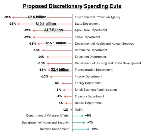
Meanwhile, at $419 billion, “Everything else” is where that extra $54 billion (his specific number) for defense would come from. Below, the Washington Post’s infographic had the percents They showed who would get less so defense could get more. Then, in black, I added several of the amounts.
You can see again how numbers can be misleading. The longest arrow did not represent the biggest amount. So yes, a percent may have been large. But the actual amounts depended on the total dollars in that department’s budget:
Our Bottom Line: Information Architecture
Behavioral economists are increasingly focusing on information architecture. Defining architecture as structure, they tell us that the structure of our information determines our understanding. And our understanding shapes our behavior.
In a paper on information architecture, scholars looked at retirement savings. When people were told that they could wind up with $5,000 a month or a total of $1 million, their saving behavior differed. Actually though, both were roughly equal since $1 million had a (typical annuity) return of $5,000 a month. However, what they were told–the information architecture–shaped their behavior.
Similarly, as voters, most of us are just not sure how trillions relate to billions. We can only evaluate federal budget cuts and additions with the appropriate information architecture.
My sources and more: Clearly displaying how big numbers befuddle us, the WSJ, here and here, presents some solutions. To take the next step with the budget, we can use the graphs in this Washington Post article and the Trump budget itself. Finally, for more on information architecture, this paper has the discussion.
(Please note that at $1,151.2 billion, the President’s budget documents presented slightly different discretionary spending totals from my infographic.)
![econlifelogotrademarkedwebsitelogo[1]](/wp-content/uploads/2024/05/econlifelogotrademarkedwebsitelogo1.png#100878)


