The Jobs That Unemployed Men Don’t Want
April 13, 2017
Weekly Economic News Roundup: From Overbooking Seats to Underusing Cash
April 15, 2017Some energy information today.
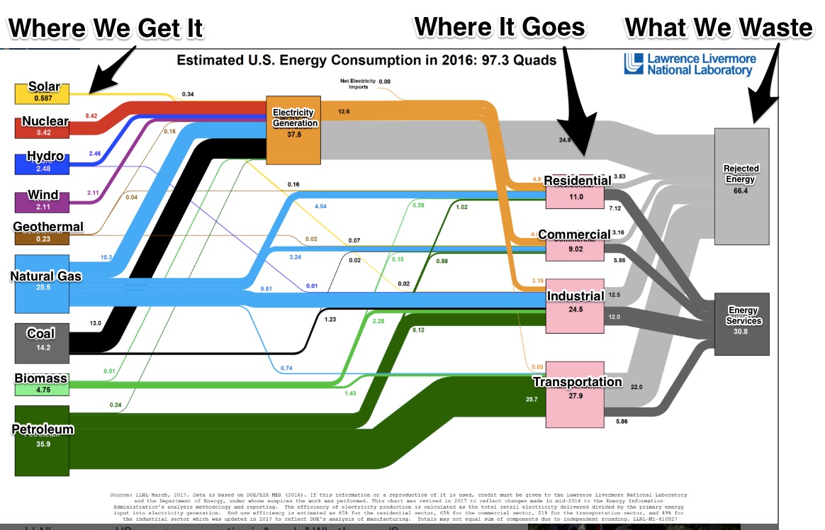
Annually, we get a new flowchart from the Lawrence Livermore National Laboratory. Showing where our energy comes from and where it goes, the chart is a handy snapshot. Alone, it illustrates the panorama of U.S. energy. Together, charts from several years tell us how our energy use has changed. And finally, since they’ve done diagrams for individual states, we can compare the whole with its parts–and compare the parts too.
A 2016 Energy Snapshot
We use a lot and waste a lot of energy. If one quad is the energy equivalent of eight billion gallons of gasoline, then we can only begin to imagine what 97.3 quads of consumption represent. As for waste, we are referring primarily to efficiency. Yes, we can assume that whenever we convert raw materials into energy, there will be some waste. But, at two-thirds of production, the “rejected” numbers are gargantuan. For transportation alone, we waste three-quarters of the energy we generate:
U.S. Energy Changes
Looking back to 2015, the overall total is pretty much the same. However, we are using less coal, more solar, more wind. Looking at their destination, only transportation’s energy use was up.
Comparing States
Here it gets even more interesting, but the differences are predictable.
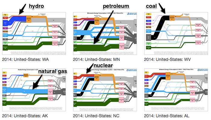
Curious about how state use varies, I took a screen shot of the Livermore 2014 links page. The thicker the line, the more that state uses that energy source. So, in Washington, hydro is supreme while for West Virginia it is coal and in Alaska (AK), natural gas:
Our Bottom Line: Price Nudges
Dollar incentives affect energy supply and demand. As the price of solar panels has dropped, our use has increased. With wind power, we have gotten better at siting and building wind farms. But even more crucially, government subsidies have supported the wind power industry. Then, for petroleum, when the price of gasoline plunged, we started driving more.
You can see that energy inevitably takes us back to the market. When the supply and demand of specific sources of energy get cheaper, we use more.
My sources and more: Amazing is the only way to describe the spaghetti diagrams in this Vox article. But it gets even better when you visit the Livermore site and compare more of their charts. Finally, for a short and clear comparison of the past two years, this AAAS article is good.
![econlifelogotrademarkedwebsitelogo[1]](/wp-content/uploads/2024/05/econlifelogotrademarkedwebsitelogo1.png#100878)


