![econlifelogotrademarkedwebsitelogo[1]](/wp-content/uploads/2024/05/econlifelogotrademarkedwebsitelogo1.png#100878)


Just Ask Jenna Looks At Judging Yourself
January 22, 2026
January 2026 Friday’s e-links: Smiling With 1970s Sitcoms
January 23, 2026
The Congressional Budget Office recently published the most up-to-date information on income distribution. Through their data, we can get a better picture of what we share through taxes.
Let’s take a look.
Income Distribution
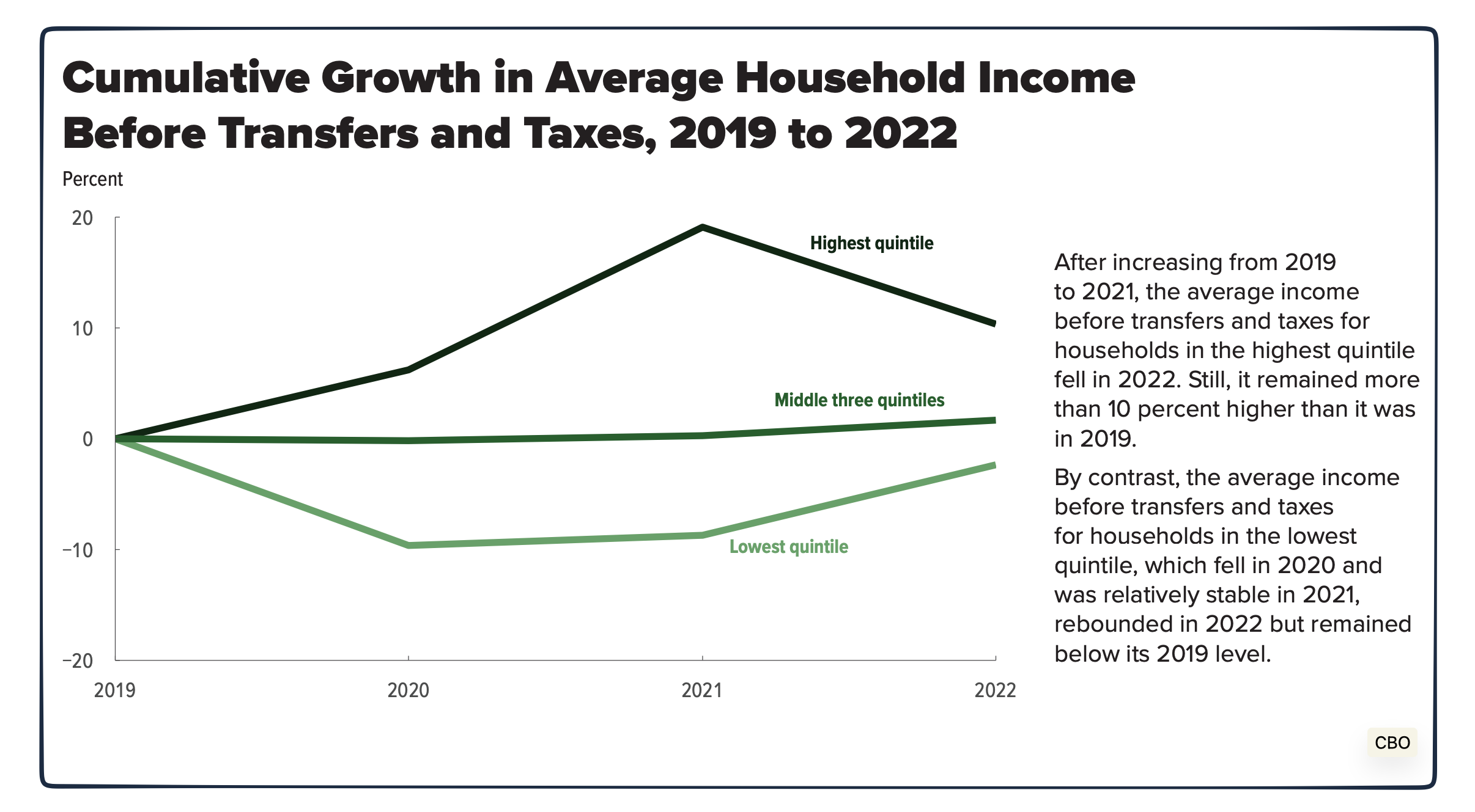
Average Groups’ Incomes
We can start with income trends before taxes. Comparing the top, bottom, and middle, we see the top with faster growth. Detailed by the CBO in their text (that I included with each graph), the highest group’s average income exceeded its 2019 level while the lowest did not:
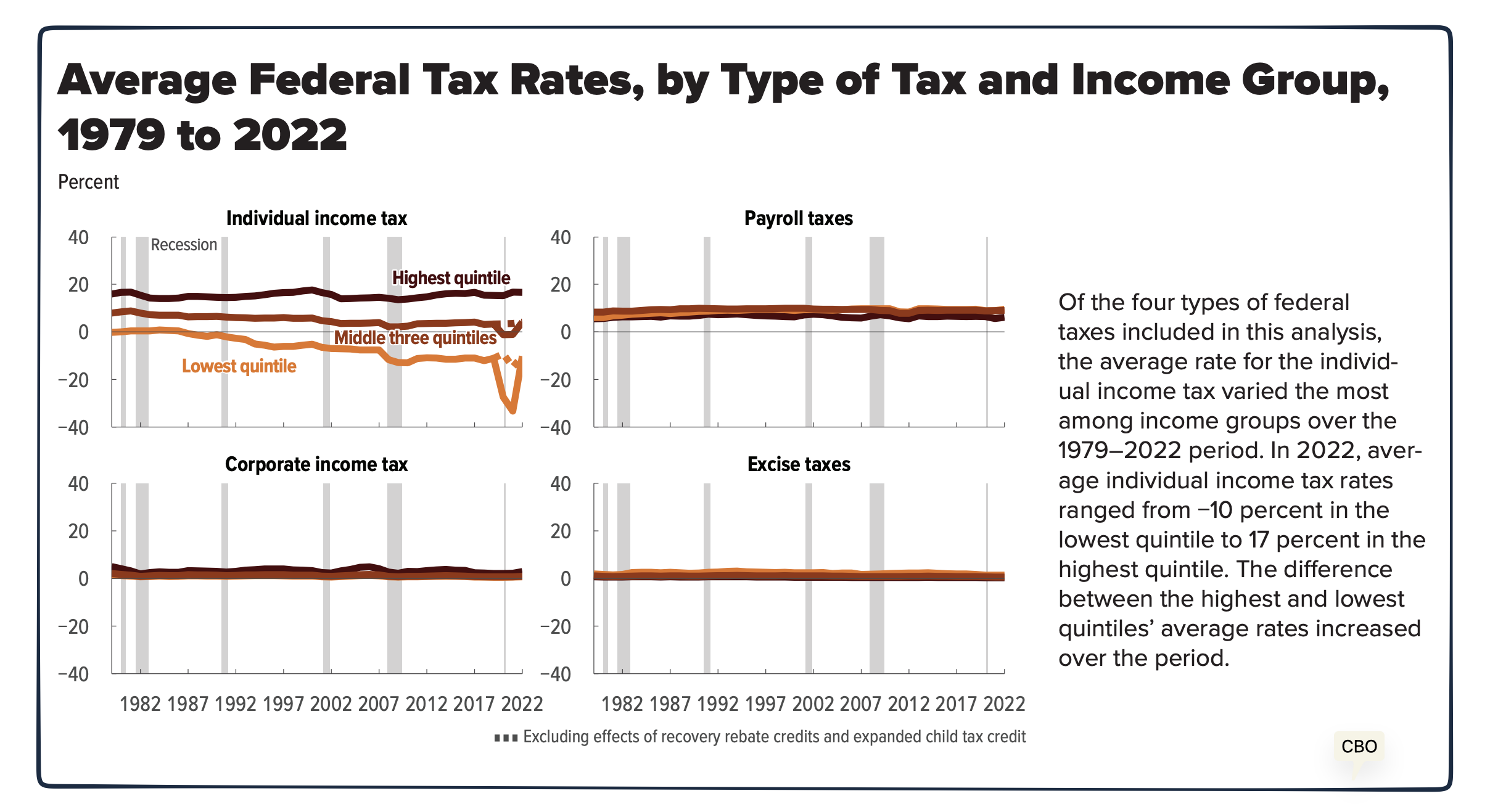
Income Groups’ Tax Rates
Taking the next step, we can say it’s what you keep that counts, more so than what you earn. With each of us affected by the four kinds of federal rates, we had the individual income tax rate in 2022 ranging from 17% for the highest earners to -10% for the lowest:
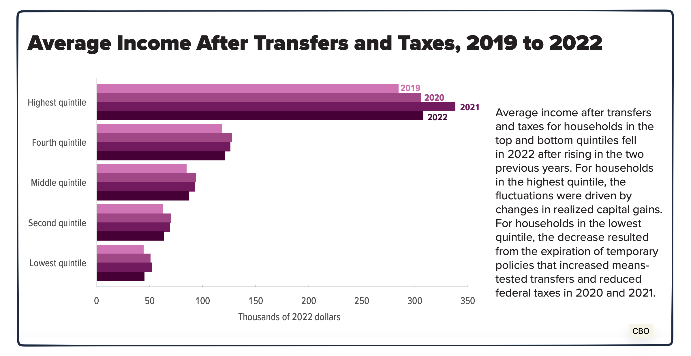
Impact of Taxes on Income
Average income changed for different reasons. Realized capital gains affected the most affluent. By contrast, the lowest income households felt the impact of expired means-tested transfers and reduced taxes:
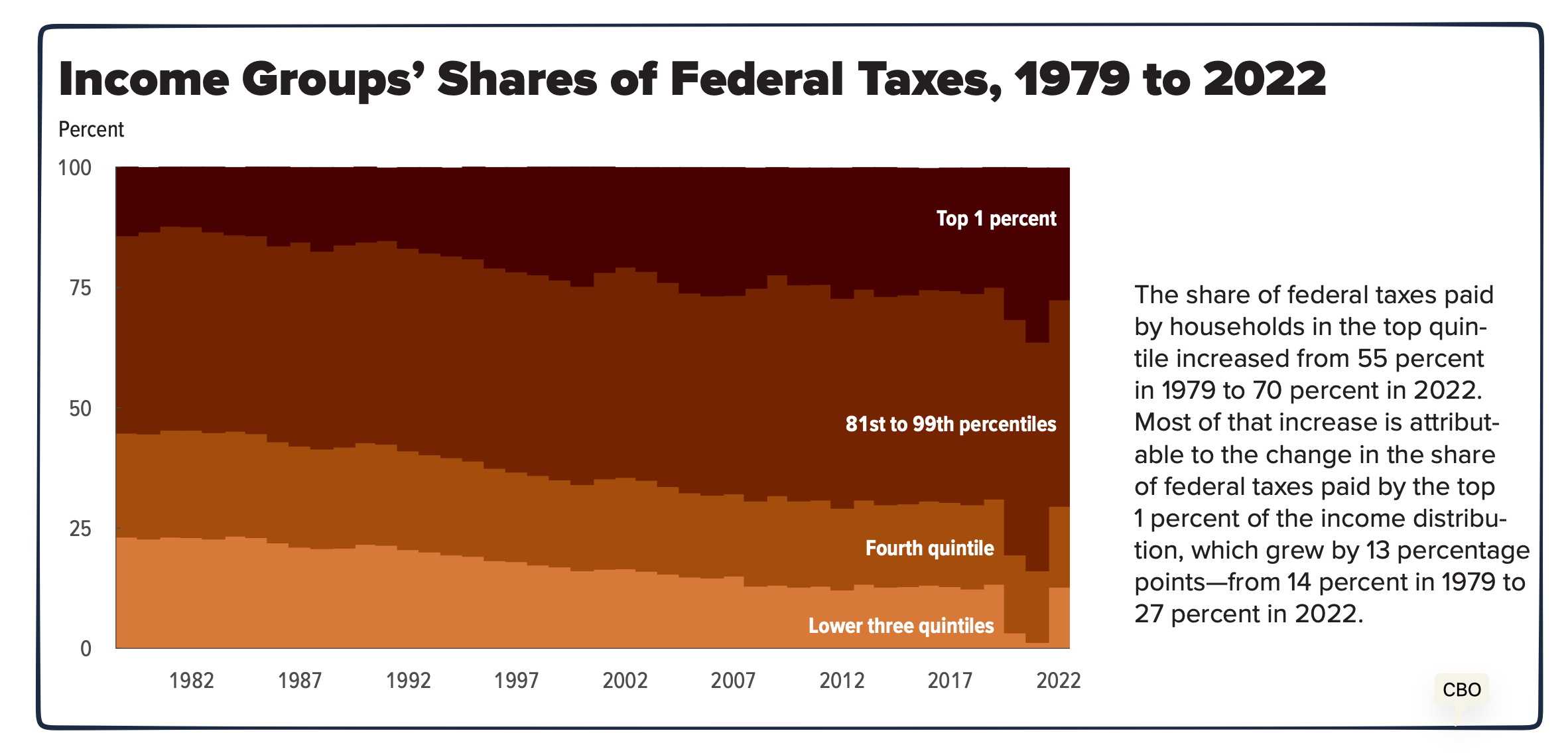
Share of the Tax Burden
And finally, we can ask how much each group transferred to the federal government:
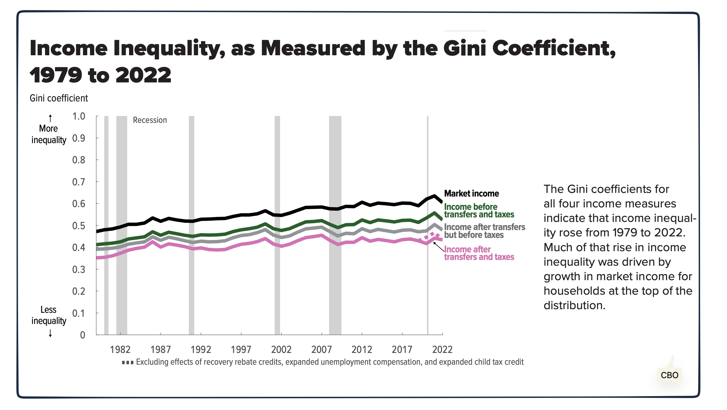
Our Bottom Line: Gini Coefficients
As a final thought, we can look at income distribution through the lens of a Gini Coefficient. Using a scale of 0 to 1, the Gini Index quantifies inequality in a country. The higher the number, the more unequal the distribution of income or consumption expenditures. Consequently, zero is perfect equality while 1 is complete inequality.
A rising Gini Coefficient reflects the growth of inequality fueled by the most affluent households’ growth in market income:
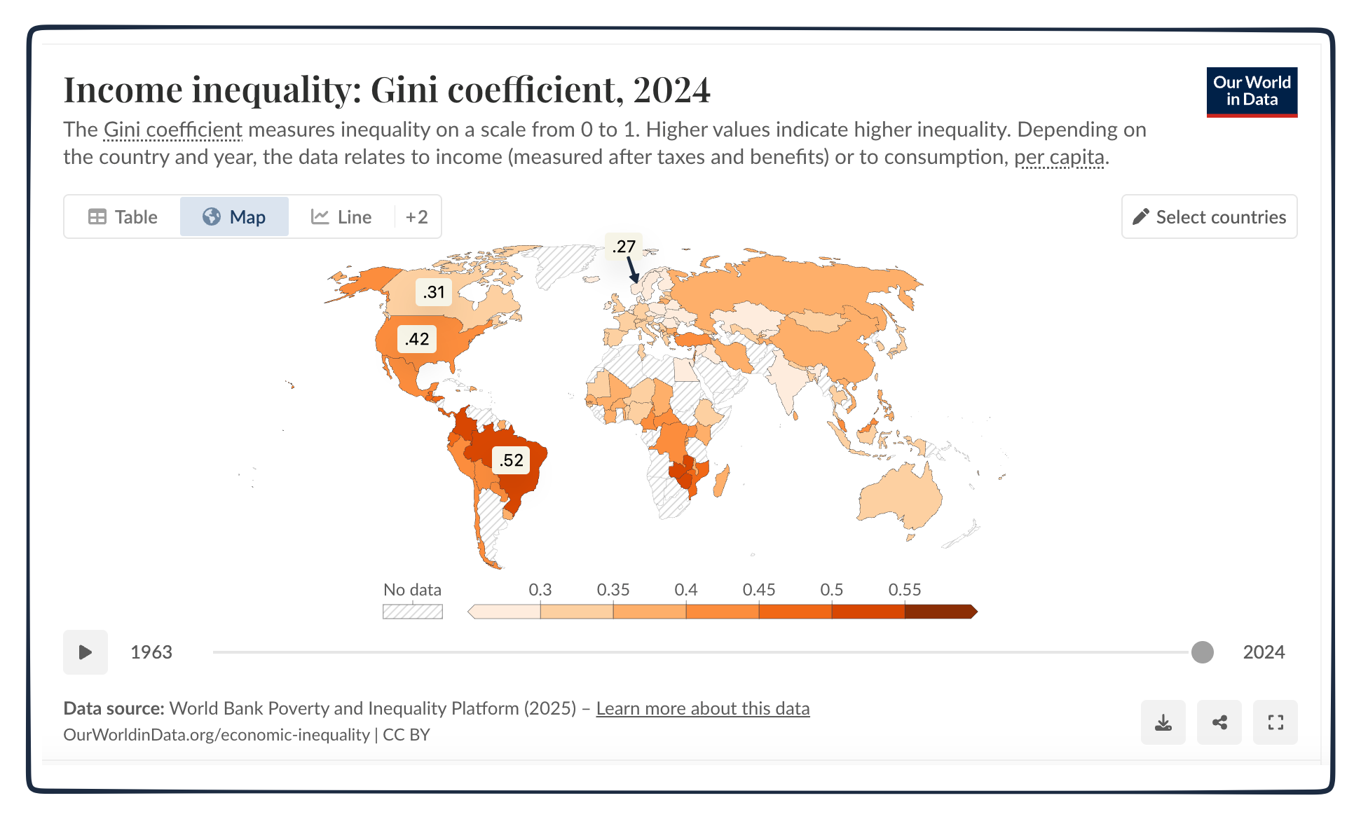
It was interesting to see how the U.S.’s Gini Coefficients compare with others.
In a list we might not want to top, for the G-7 countries (U.S., U.K., Italy, Japan, Canada, Germany, France), the U.S. has the highest Gini Coefficient. As for the rest of the world, Norway, Sweden, and Finland were among the nations with the lowest Gini Coefficients whereas Brazil was up there with a much higher number:
My sources and more: Thanks to Timothy Taylor’s Conversable Economist for inspiring today’s post. From there, the CBO’s document came in handy.
Please note that several of today’s sentences were in this past econlife post. Also, based on different years, the global Gini numbers were for the most recent dates that were available.

