Why We Like the Pumpkin Spice Latte
August 31, 2022
Why a Starbucks Macchiato Is Like a Model-T Ford
September 2, 2022The World Economic Forum recently published its annual Global Gender Gap Report. In a 374 page study, they move from four general categories to a list of specific subindexes. Looking at the world, at regions, and at individual nations, their numbers refer to the gap in a country.
As we consider their data, please think about the gargantuan amount of land, labor, and capital that the gender gap wastes.
The Global Gender Gap
The Four Categories
Through its four categories of indicators, the Report compares men and women. A score displays the extent to which the gender gap has been closed. As a result, a country’s number reflects the distance to parity that it has achieved. Assume for example that college enrollment is 100 percent for men and for women in Country A and 60 percent for both in Country B. Though the numbers are very different, the 100 and 60 each show men and women at the same level. Consequently, Countries A and B would have a similar rank. They both display parity.
These are the four categories:
- Economic Participation and Opportunity
- Educational Attainment
- Health and Survival
- Political Empowerment
Among the 10 countries with the smallest gender gap, Iceland has topped the list for 13 years:

You can see below that politics and economics had the largest disparity. With a 68.1 percent global average, we can say a 31.9 percent gap remains to be closed:
 Comparing 2021 to 2022, the WEF told us that the economic and health indices indicated a slightly smaller gap. Meanwhile, for education, the gap grew and political empowerment remained the same.
The Subindexes
When we look more closely, the country scores vary with two obvious outliers. Consistently, Afghanistan trailed behind for almost all criteria while Iceland, at the other end, is a clear leader. Meanwhile, the Report tells us that Educational Attainment and Health and Survival were the most highly concentrated since the Report began in 2006. At the same time, global economic parity varies considerably.

Our Bottom Line: Production Possibilities
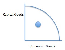
What it all adds up to for us is a massive underutilization of resources. As economists, we can display the waste of land, labor, and capital through our dot on a production possibilities graph.
The curve shows the maximum potential of an economy. The dot indicates the underutilization that is created when a country fails to optimize female time and talent:
My sources and more: For a bonanza of gender equity data on 146 countries, do spend some time with the WEF report. and this WEF summary. Then, for more on past reports, I expressed some skepticism with ranking, here. Please note that all charts and graphs (except for what I drew for production possibilities) are from the Global Gender Gap Report 2022 and the WEF summary. Also, we’ve repeated our “Bottom Line” and an explanation of the Report’s definition of parity from past econlife posts.
![econlifelogotrademarkedwebsitelogo[1]](/wp-content/uploads/2024/05/econlifelogotrademarkedwebsitelogo1.png#100878)


