![econlifelogotrademarkedwebsitelogo[1]](/wp-content/uploads/2024/05/econlifelogotrademarkedwebsitelogo1.png#100878)


Our Weekly Economic News Roundup: From Ranking Airlines to Trading Stock
February 27, 2021
All You Could Ever Want to Know About the Subway Footlong
March 1, 2021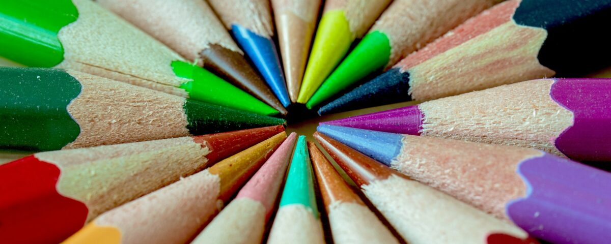
In The Devil Wears Prada, Meryl Streep (wonderfully) told us about color:
But there is much more…
Standardizing Color
Assume for a moment that you will be using the color purple for a project. You just need to say 3515C:

The story of that number starts during the 1960s. At a commercial printing company, when customers used to name the color they wanted in a document, no one was precisely sure what they meant. So, the owner decided to number his colors and rename his firm Pantone. The result was a book that, by the 1970s, had sold more than 100,000 copies. A best seller, it specified a number for a color and made life much easier (and accurate) for many people.
Still in the color business today, Pantone says that they “help define, communicate, and control color.” Through a website list of products and services, you can see that they assist “color conscious” industries that range from architecture to beauty. Also, they name a color of the year that becomes the benchmark for what is “in.” Adorning eyes and covering couches, the color is adopted by countless companies for current designs. Supposedly, it represents a contemporary image and conveys a message. The 2020 color of the year, classic blue, represented “calm, confidence, and connection.”
This year, they selected ultimate gray and illuminating (yellow). They called the combination a “marriage” of “strength and hopefulness.” But, do take a look at their video and decide if you get the message:
Our Bottom Line: Standardization
As economists, we can say that Pantone’s color charts are examples of a standardization process that began more than 200 years ago.
In 18th century France, there were 250,000 different units of measurement, some with different names and some, the same. Assorted fabrics, grain, and wood all had their own metric. If you sold a pint in several places, the amount could have varied by 20%.
It all changed during the 1790s when two scientists attempted to create some standardized measurement. First they had to define a metric and then to universalize it. As for the measurement, they focused on the meter by calculating the distance from the North Pole to the Equator and dividing it by 10 million. The task was actually a huge trigonometry problem as each one traveled from one place to the next creating imaginary triangles to measure the distance. Then, from the size of the meter, they could leap to the kilogram and define it as “a cubic decimeter of rainwater at 4 degrees Celsius.”
But much more than measurement, standardization is about commerce. Only when we know how much we are selling and buying can we minimize the hassles and focus on the market.
We can also know what Meryl Streep meant when she referred to cerulean blue:

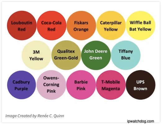
And finally, returning to our title, these might be the colors we care about:
My sources and more: Yesterday, a Slate podcast on Pantone’s colorful history made my daily walk more interesting. Then, I visited the Pantone website and this House Beautiful article for some color of the year history. But if you want just one link about standardization, do return to this 2014 Radiolab podcast on the kilogram. (Please note that parts of “Our Bottom Line” was in a previous econlife post.)
