What We Need to Know About Immigrants
June 6, 2023
Why Your Name Matters
June 8, 2023As graphics that illustrate the numbers of males and females at a certain age in a designated geographical area, population pyramids show a nation’s demography. From there, though, we can create a story.
The U.S. Census published this U.S. population pyramid for 1900. Our story begins with a rather young population:

Population Pyramids
Hopscotching from 1900 (above) to 1929, 1970, and 2000, you can see how U.S. demography changed. As the tops of our pyramids move up, so too does the bulge at the bottom:
1970

2000

As for the story, it all takes me to U.S. economic growth:

Our Bottom Line: Comparing Population Pyramids
Giving me the idea for today’s focus, the Visual Capitalist compared population pyramids;
They displayed the difference between Europe and Africa:

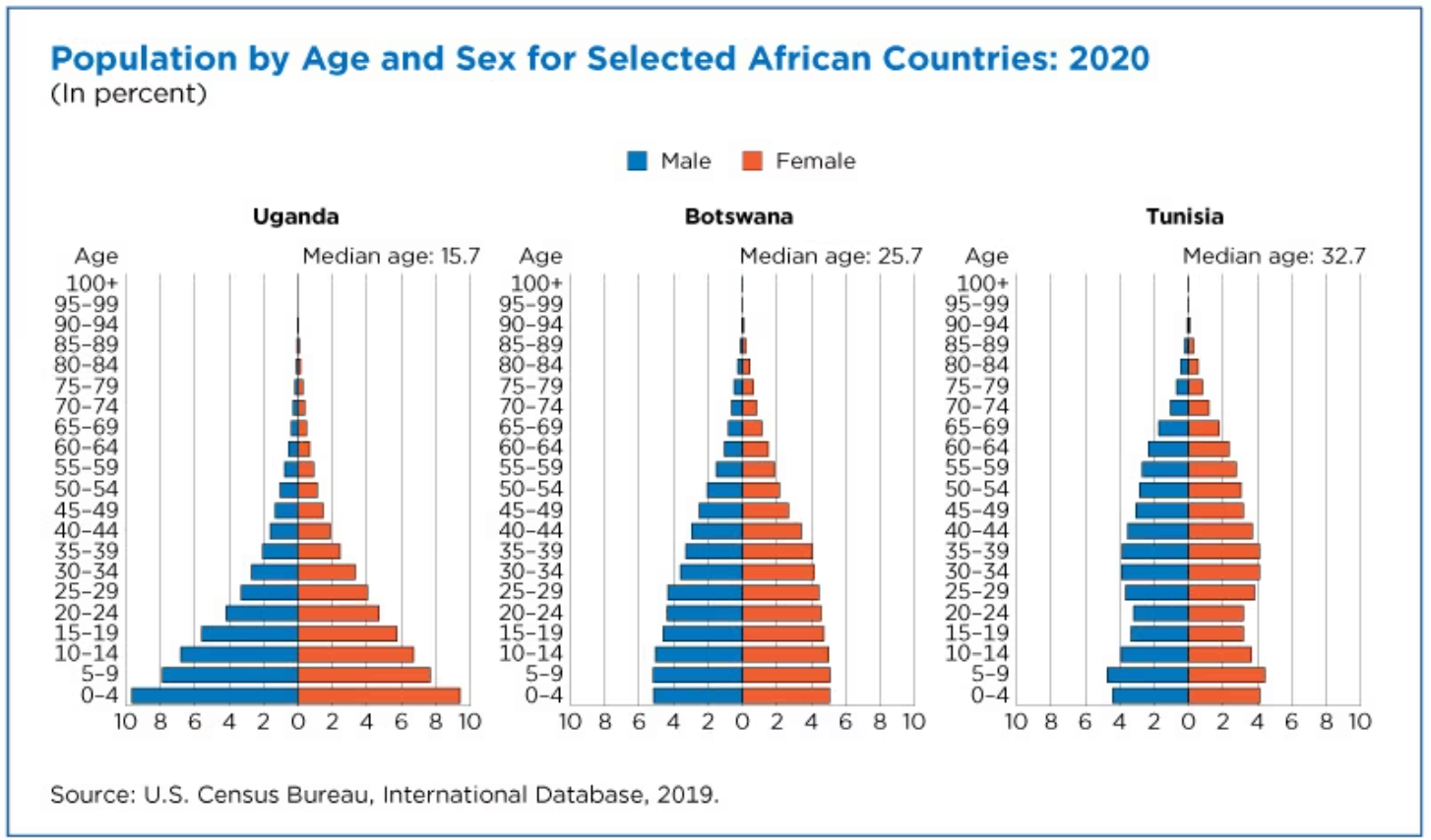
However, I was especially captivated by the similarity between Uganda’s 2020 population pyramid and the U.S. in 1900. We can see that both were rather young. With a median age of 15.7, and half of its population below 15, Uganda has a vast number of children. Both could be classified as developing nations:
Indeed, all of these pyramids tell a development story.
My sources and more: Thanks to Timothy Taylor’s Conversable Economist for inspiring today’s post. From there, the U.S. Census, here and here, and here, the Visual Capitalist had more detail and some wonderful images.
![econlifelogotrademarkedwebsitelogo[1]](/wp-content/uploads/2024/05/econlifelogotrademarkedwebsitelogo1.png#100878)


