
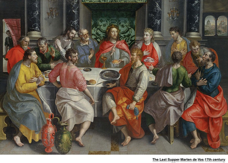
The Last Supper has gotten bigger.
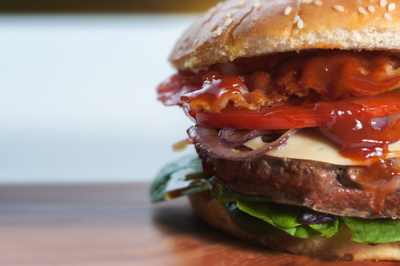
For a long time, we’ve been eating more.
Portion Sizes
When scholars from Cornell and Virginia Wesleyan compared 52 of the best known representations of the Last Supper from the past 1,000 years, they focused on the entrée, the bread and the plate size. Through an approach that was more technical than a look and a measure, they created average head size/portion size ratios.
The results? In 54% of the paintings, the last supper was fish and eel, lamb, or pork. The other 46% remains a mystery. Indicated by circle size below, from 1000 to 1700, those entrées got bigger:
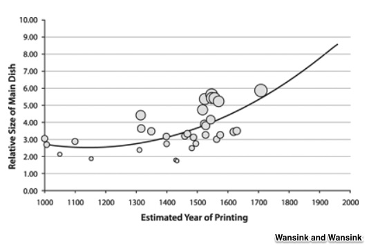
In addition to the main course, the bread and the plate grew. According to the study’s estimates, from 1000 to now, the main course was up 69.2%, the bread, 23.1% and plate size, 65.5%
This is the “math” from the paper:
Our Bottom Line: Malthus
Perhaps one of the first environmentalists, Reverend Thomas Malthus told us in 1798 that population grows geometrically while resource production expands arithmetically. He thought that resource prices will rise and supply will become increasingly inadequate.
Instead, you can see what has happened to U.S. agriculture:
Farm output is up:
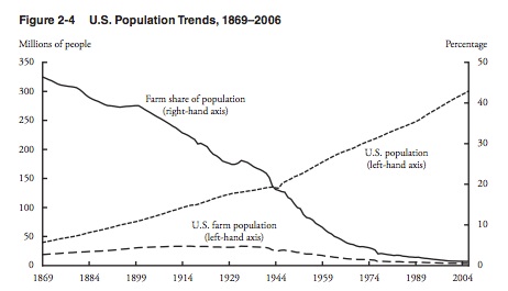
Farm population is down:
Farm size is up:
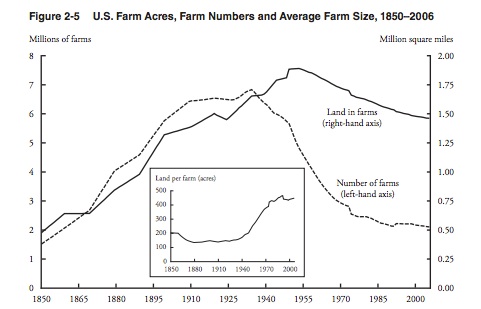
As our last supper portions have grown, so too has farm productivity, food affordability, food safety.
My sources and more: Our academic look at portion size is here and here (Wansink and Wansink). Then, for more about Malthus, econlib is a handy site.
Please note that our farm graphs and Malthus section were from a previous econlife post. Also, we have pointed out at econlife that some school- based studies from Brian Wansink had statistical mistakes.


